Paragraph Titles - RalewayParagraph Titles - Raleway ItalicBody Text - Open Sans.
We like open sans because it looks sweet and complements the rest of the typography, which Kyle and Meredith have done nicely with. In fact, Meredith used Open Sans for a project we worked on together recently, and I am quite fond of it. Body Text - Open Sans Italic.
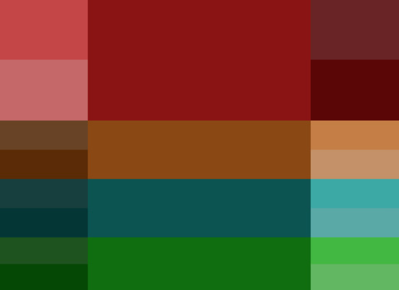
We like open sans because it looks sweet and complements the rest of the typography, which Kyle and Meredith have done nicely with. In fact, Meredith used Open Sans for a project we worked on together recently, and I am quite fond of it. Extended Pallette (Logo) |
Paragraph Titles - Raleway BoldParagraph Titles - Raleway Italic BoldBody Text - Open Sans Bold.
We like open sans because it looks sweet and complements the rest of the typography, which Kyle and Meredith have done nicely with. In fact, Meredith used Open Sans for a project we worked on together recently, and I am quite fond of it. Body Text - Open Sans Italic Bold.
We like open sans because it looks sweet and complements the rest of the typography, which Kyle and Meredith have done nicely with. In fact, Meredith used Open Sans for a project we worked on together recently, and I am quite fond of it. Extended Pallette (Duotone) |


